
shiftone.com
MomentSnap completed a $2.3M fundraising round. Some rejuvenation was in order.
We decided to rebrand: MomentSnap would become ShiftOne. I was responsible for honing our message and bringing it to bear in a new website.
Project: Company Rebrand
Scope: Craft new core messaging. Design new website.
My role: Lead writer
Stakeholder: CEO
Goal(s): Clarify message. Increase site conversions.
Challenges: How can we convey our value add — increasing revenue while decreasing employee-related costs — concisely yet humanly? How can we tweak the site flow to funnel prospects to landing pages?
Basic process: Core Message > Layout/Flow > Design/Copy > Prototype > Test > Launch
Results: ~400% increase in conversions
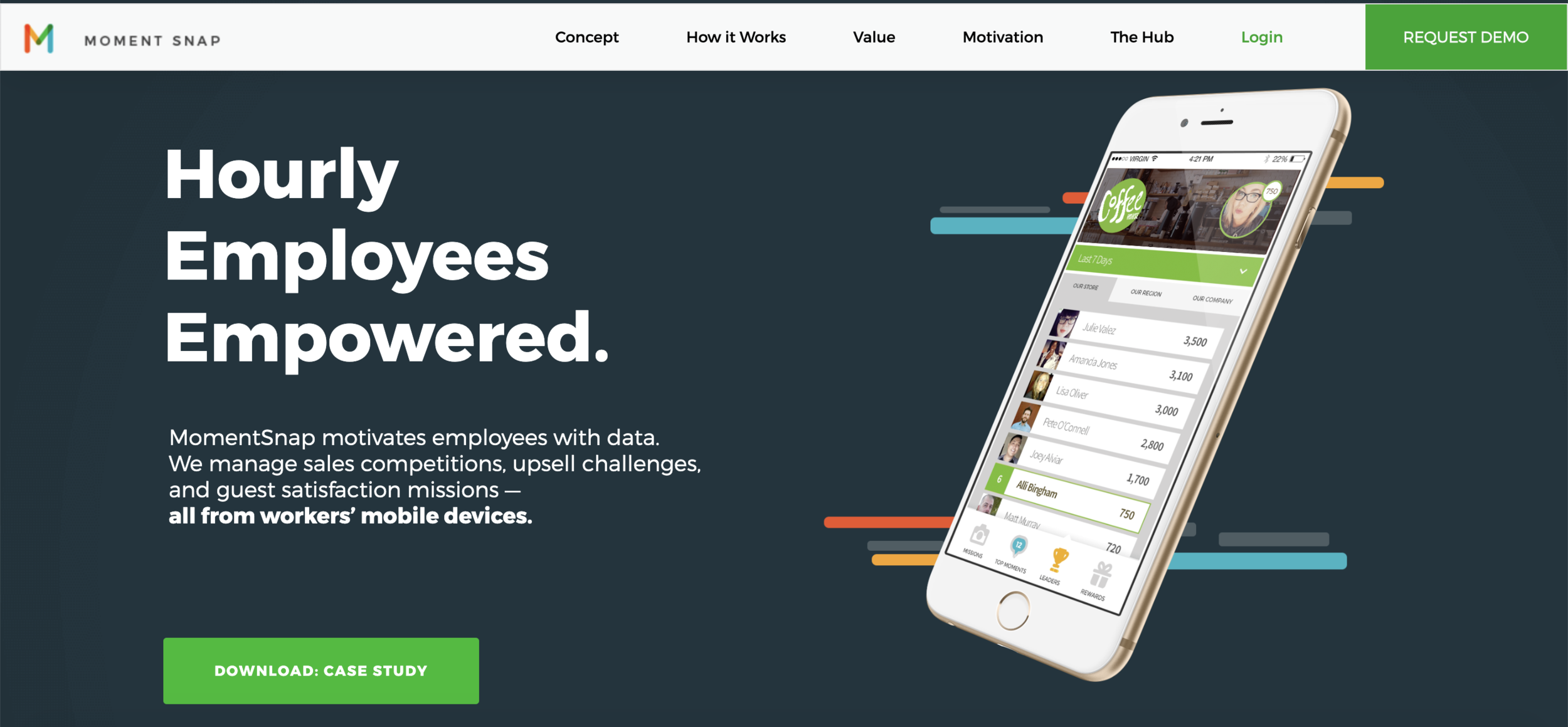
Pre-Rebrand Header Section
MomentSnap’s slogan and a basic product screenshot monopolized our legacy header but failed to convey our value proposition. The subtext offered only vague context. The landing page link was premature. Few site visitors made it to the gated content, and only 2-3% converted.
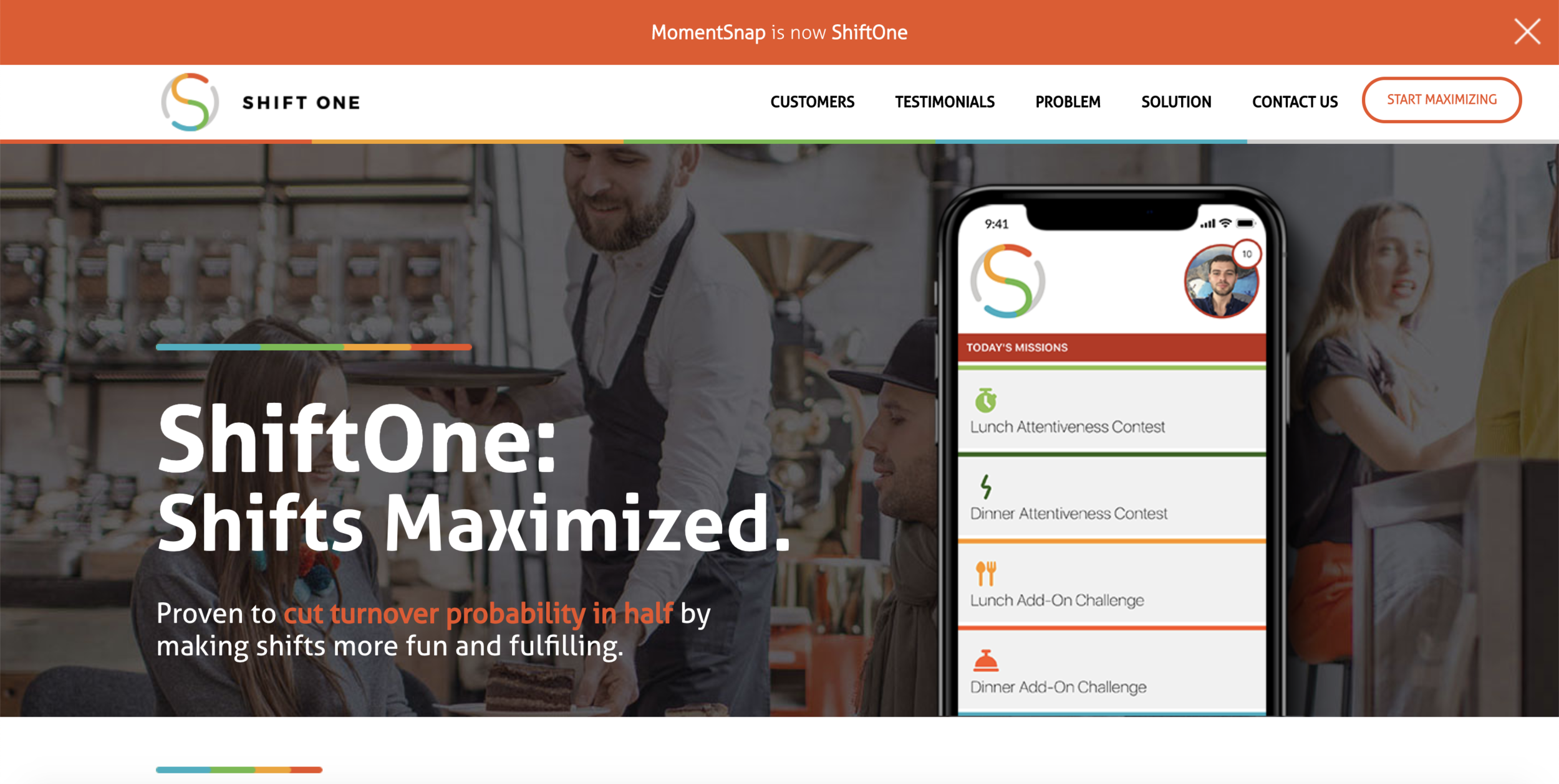
Rebranded Header Section
The new slogan primes prospects for a tangible value add. The subtext emphasizes a hard metric but concludes on a human note. I tested different phrases as subject lines in a MailChimp campaign: “cut turnover probability in half” yielded the best open rate.

Pre-Rebrand What We Do Section
The below-the-fold graphic conveyed nothing about how the app worked. No other context was offered.

Rebranded What We Do Section
I tossed out the graphic and wrote impact statements that articulate ShiftOne’s value in succinct, tangible terms.
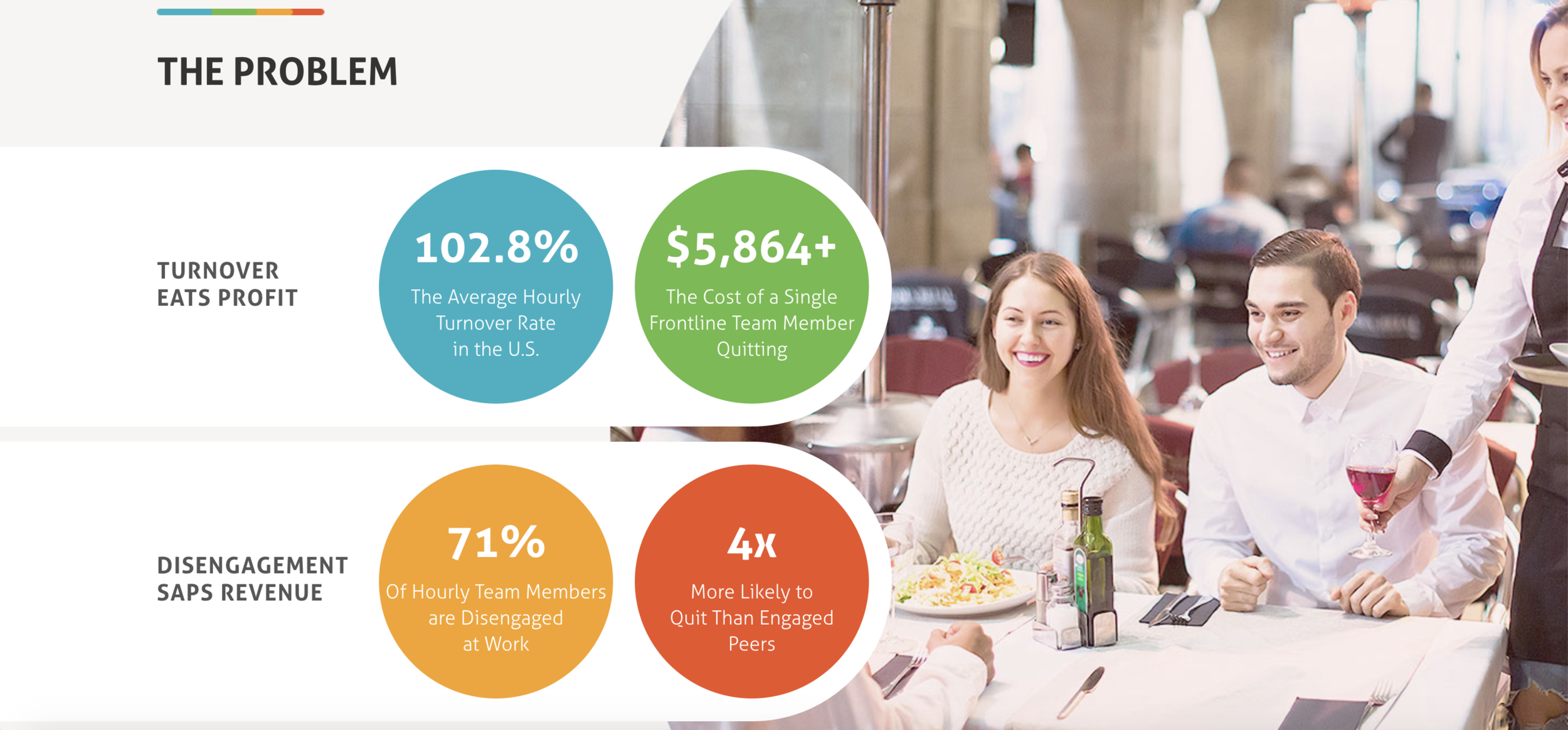
Problem Statement Section
I added a new section that establishes our problem statement, which the pre-rebrand site lacked.
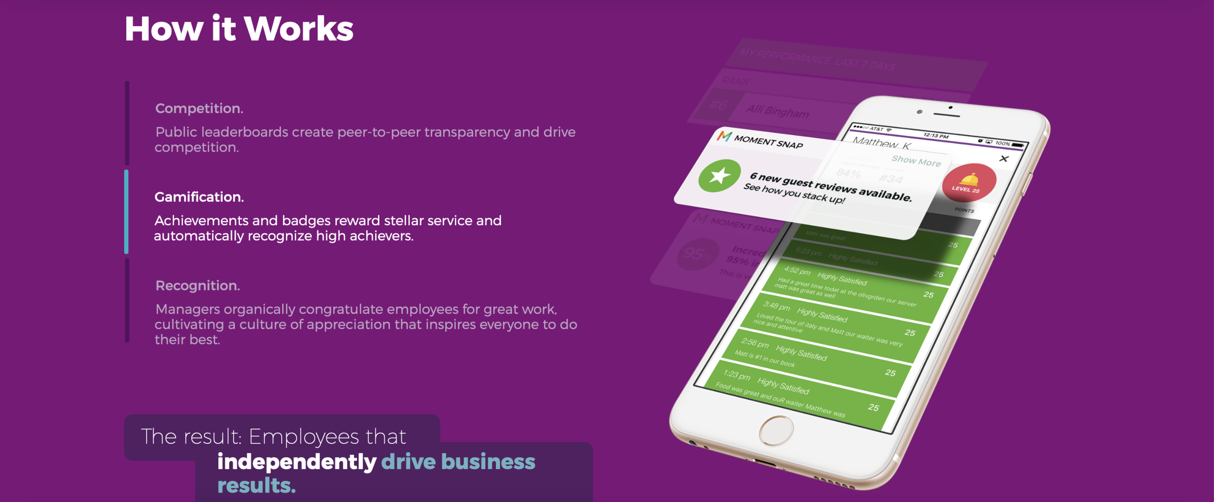
Pre-Rebrand How it Works Section
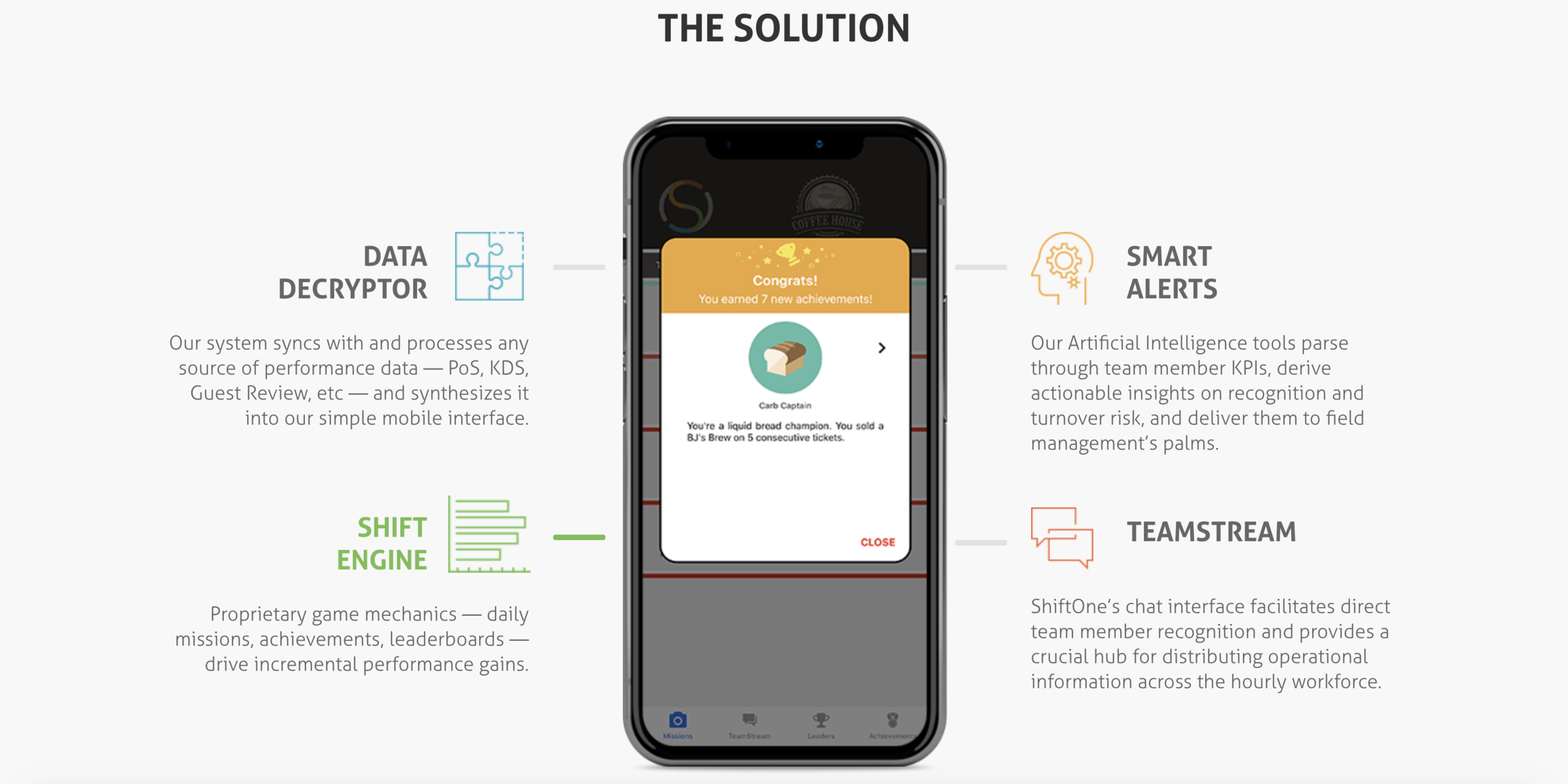
The section that was meant to explain the product expanded on concepts rather than features. The culminating claim seemed tenuous for lack of data.
Rebranded How it Works Section
Adding the problem statement section allowed me to position the “How it Works” section as a “solution.” I described branded features instead of the philosophy behind them.
Pre-Rebrand Value Section
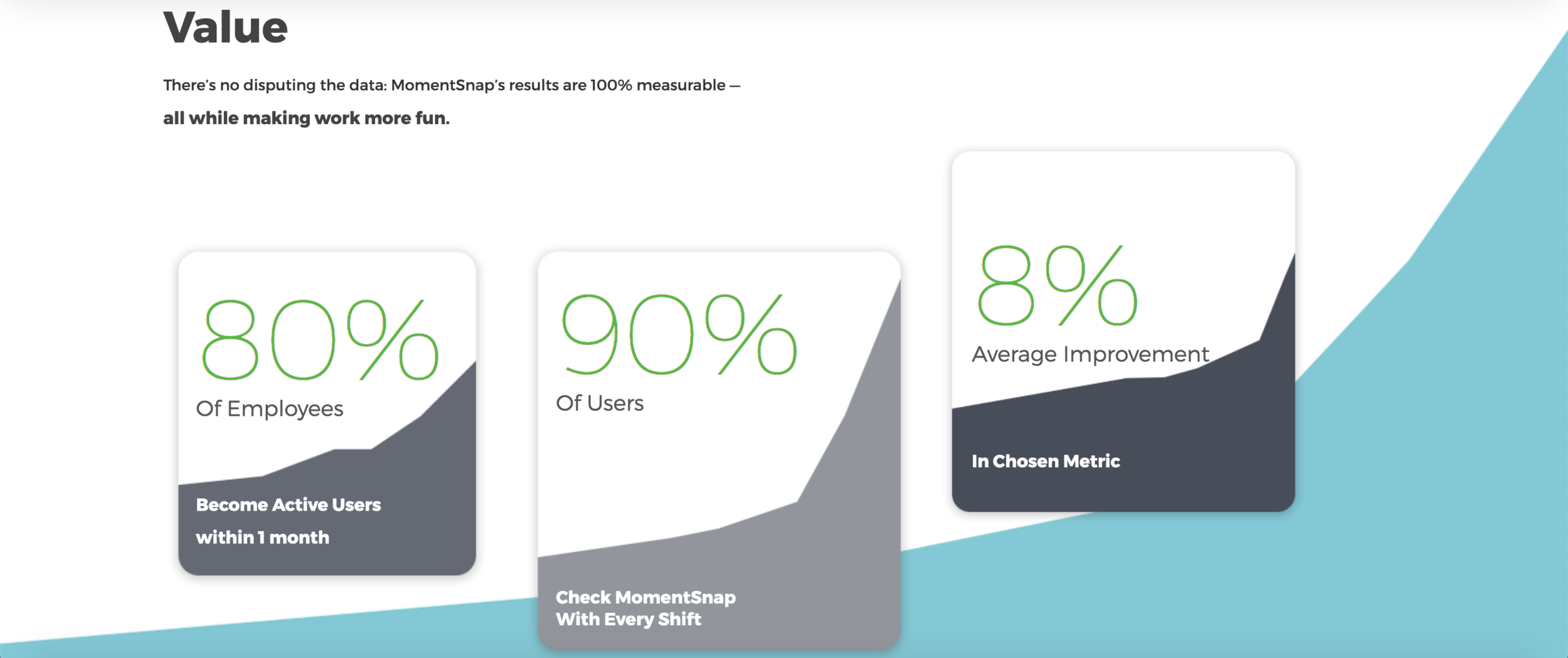
Our “Value” section presented the wrong numbers. Sustained usage was important, but we knew bottom line metrics were more important to prospects. We included only one.
Rebranded Value Section & Project Results
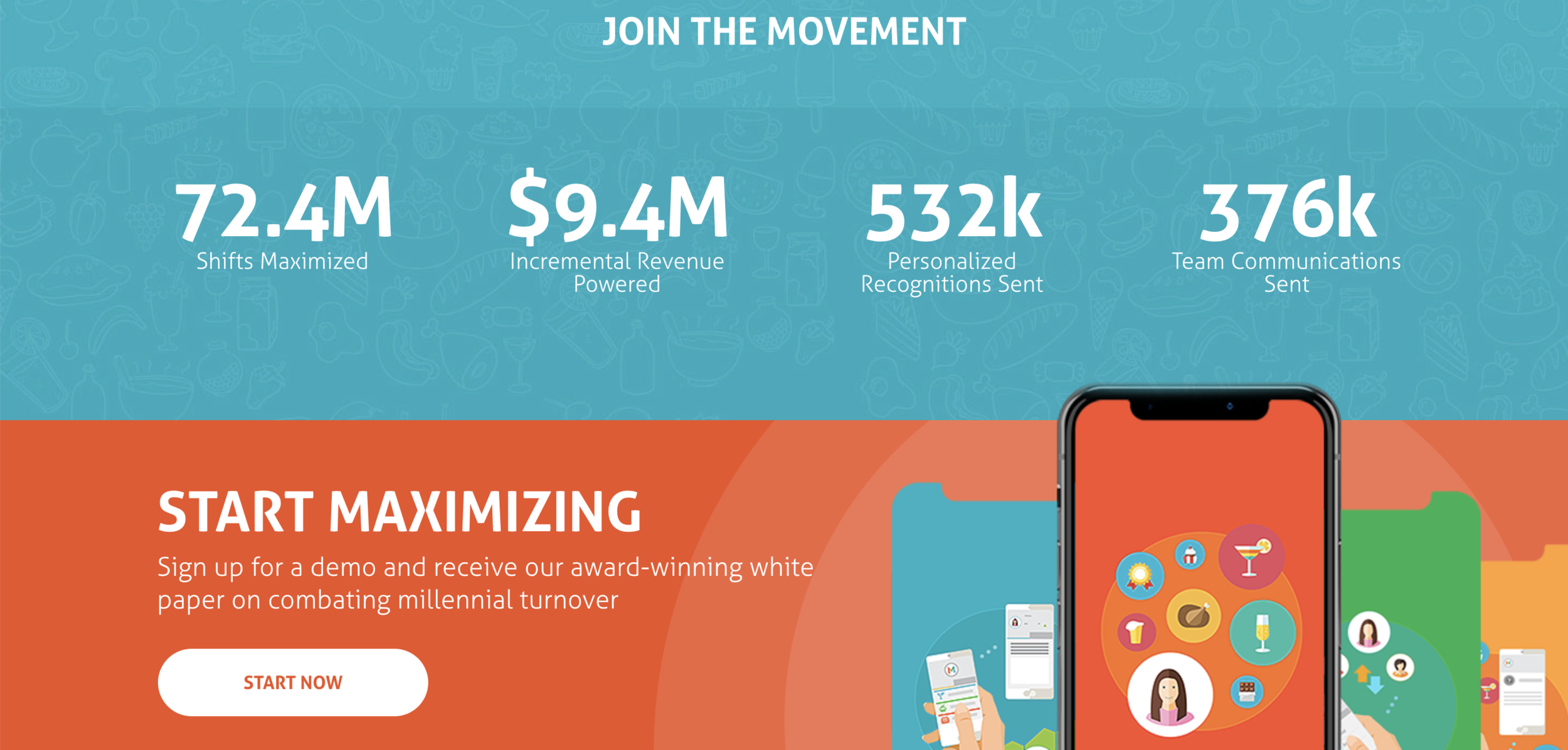
I wanted the final section to describe our results while also concluding the page’s “story,” so I used individual shifts — the crux of our new name and ethos — as the basis for our value calculation. I relocated the landing page link here, betting that the narrative would carry prospects down the page.
Our pre-rebrand gated content conversion rate was 2-3%. The new site yielded a 12-15% conversion rate.
Woohoo!